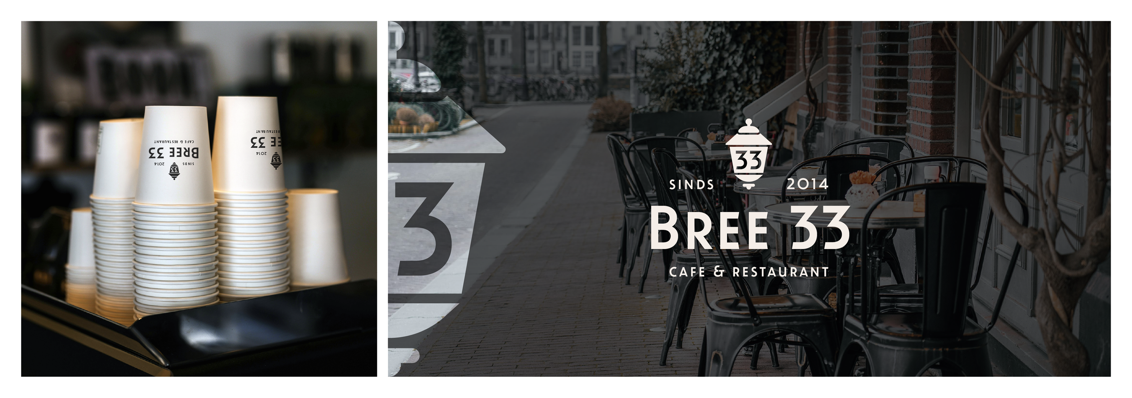
This self initiated project is apart of a series of logo rebrands.
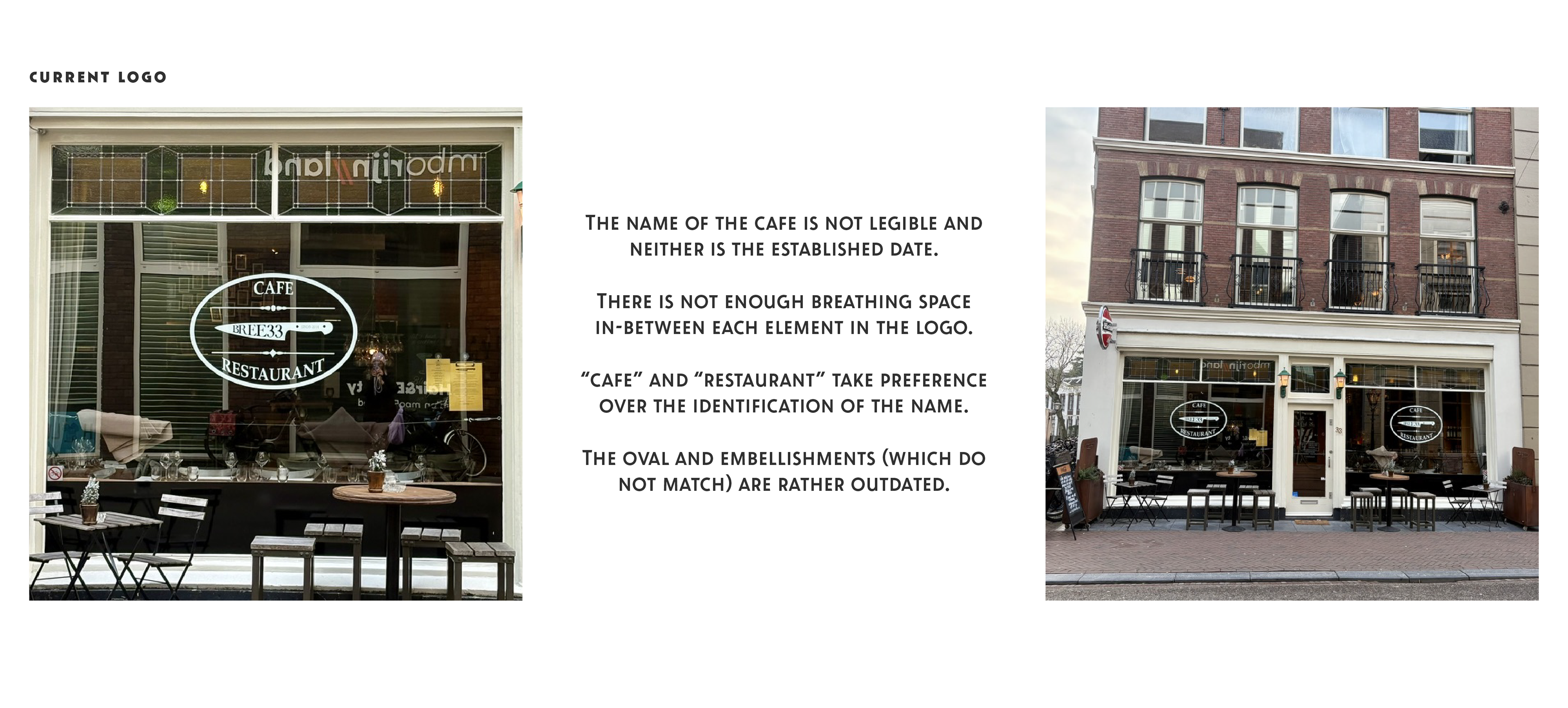
"Bree 33" is a contemporary restaurant and cafe in Leiden, Netherlands. I often walk past this restaurant and felt its logo needed a refresh. The restaurant is set in a beautiful old Dutch building but the logo isn't legible and lacks attractiveness.
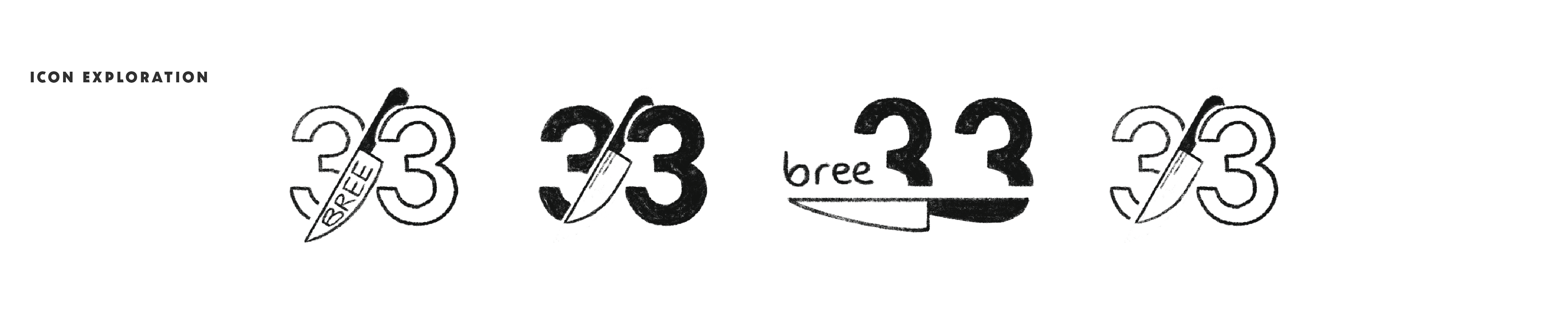
I did some rough sketches of what I thought the logo could look like by incorporating the name and the knife (as used in the current logo)
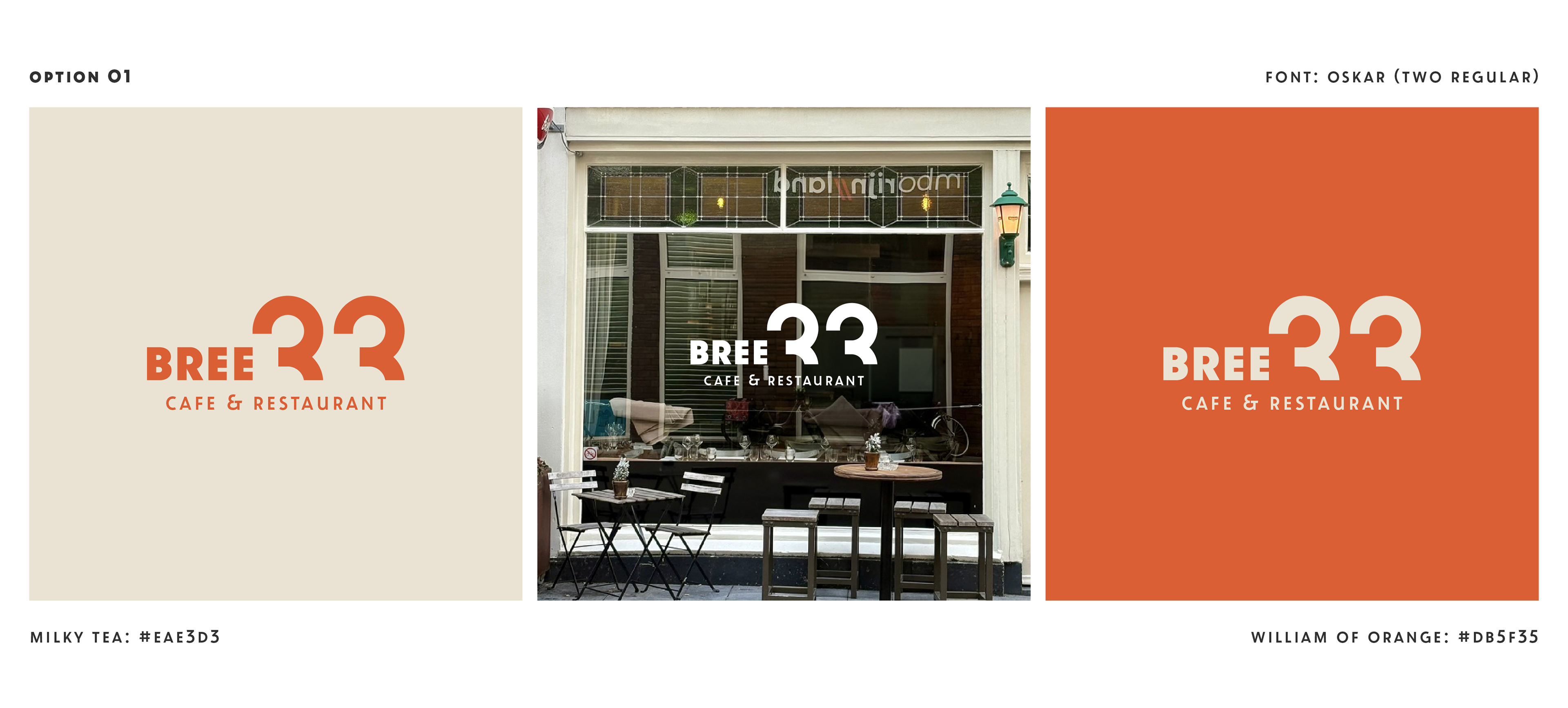
I like this contemporary version with the use of negative space in the number. I also incorporated the use of the countries national colour of orange.
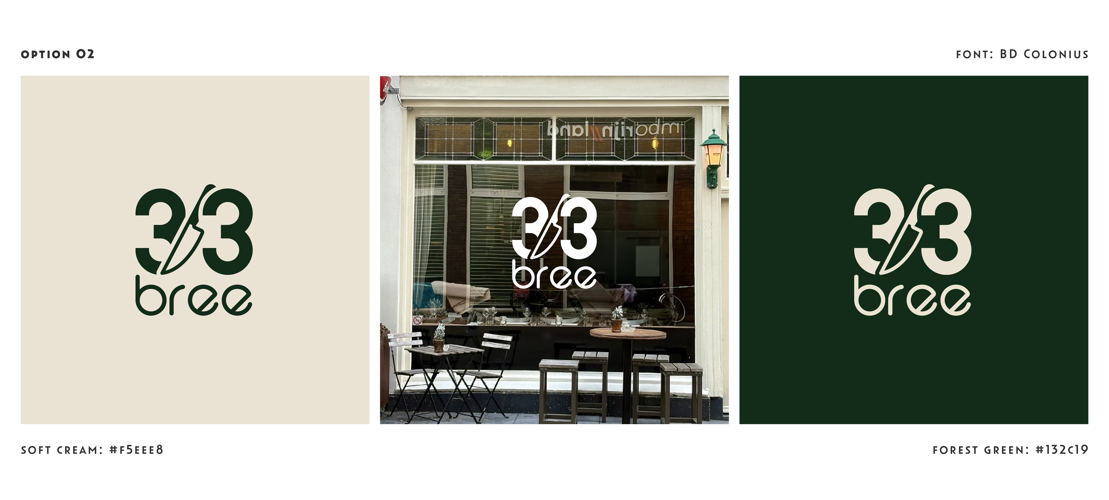
This option was a strong contender as I loved the incorporation of the knife and number. I did however feel that it was perhaps more suited for a coffee shop and less for a upmarket restaurant.

Logo 03 was the strongest option in my opinion as it is bold, contemporary and striking. The icon pays homepage to the two green lanterns outside the front door.
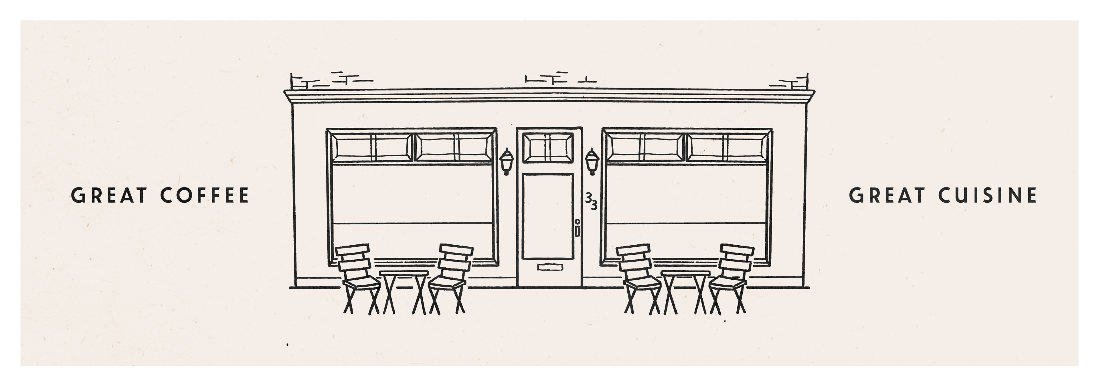
The illustration of the restaurant's facade could be used on the menu or as a banner on the landing page of their website.